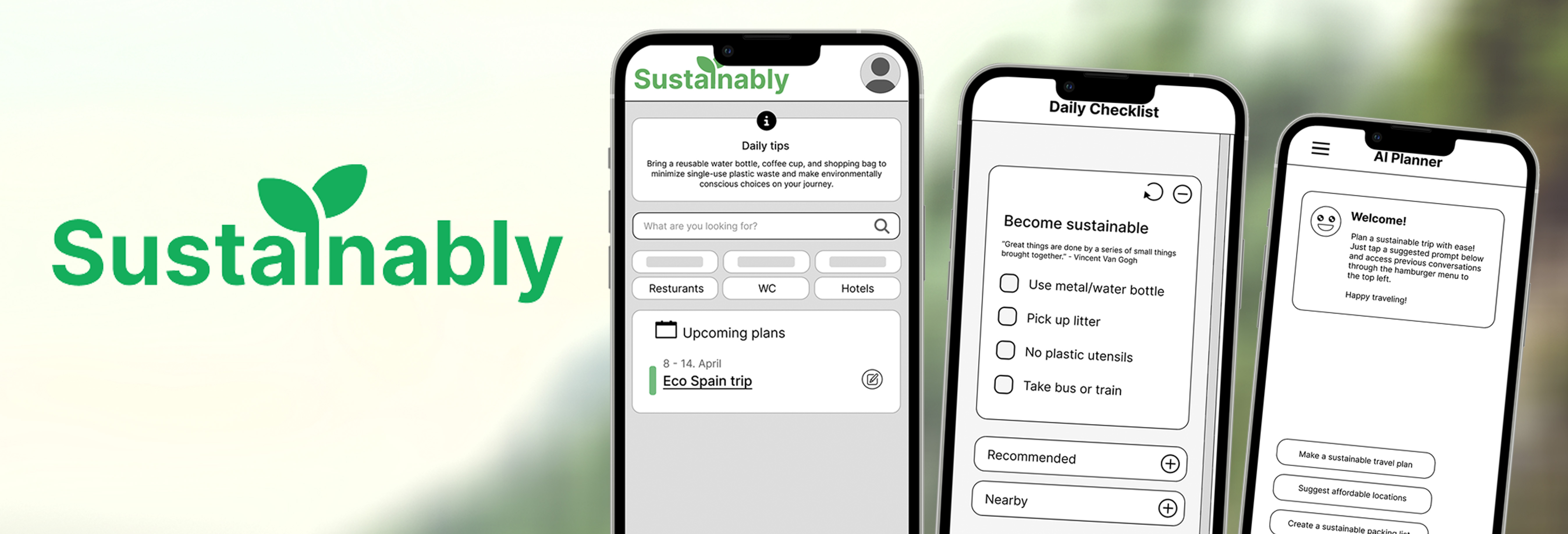
Sustainably - Creating the solution
Sustainably - Creating the solution
Background and the problem
Everywhere in the media, they all talk about it. Over-tourism, and its effect on the environment. With this project, my team and I at the time wanted to address the increasing demand for sustainable travel options. To do so, we needed to understand the topic more further. Most travelers want to lessen their Co2 footprint, but struggles to maintain and do so.
My Contribution
This was a group project I did with my student team. We communicated every day through discord, where we divided the workload. We cooperated on most of the research work, and divided what user- and task-flows, frames & elements each would do. My biggest contribution was with recruitment, design and facilitating most of the usability tests.
UX Objectives
- Research & Define users and their needs
- Ideate & plan a solution to the problem
- Create a low-fidelity wireframe prototype
- Test and do iterations based on results
UX Role and tools
Project type & Duration: UX Design & 8 weeks
Role in the team: Researcher, interviewer, UX designer, Usability Testing facilitator & recruiter.
Tools: G Suite, Figma/FigJam, Miro, Zoom
Our Hypothesis
Users want to travel sustainably, but struggle due to traveling fees and lack of awareness.
Design Thinking Methodology
For this project, we used Design Thinking to plan the project steps. This is often a non-linear and iterative process, that can start at different points in its 6 steps. We started at the first stage, since I needed to to generative research. The method is broken down into 6 parts: Empathize, Define, ideate, prototype, test & implement. For this project, we only created a low-fidelity prototype with post-test iterations.

Empathize & Define
Research
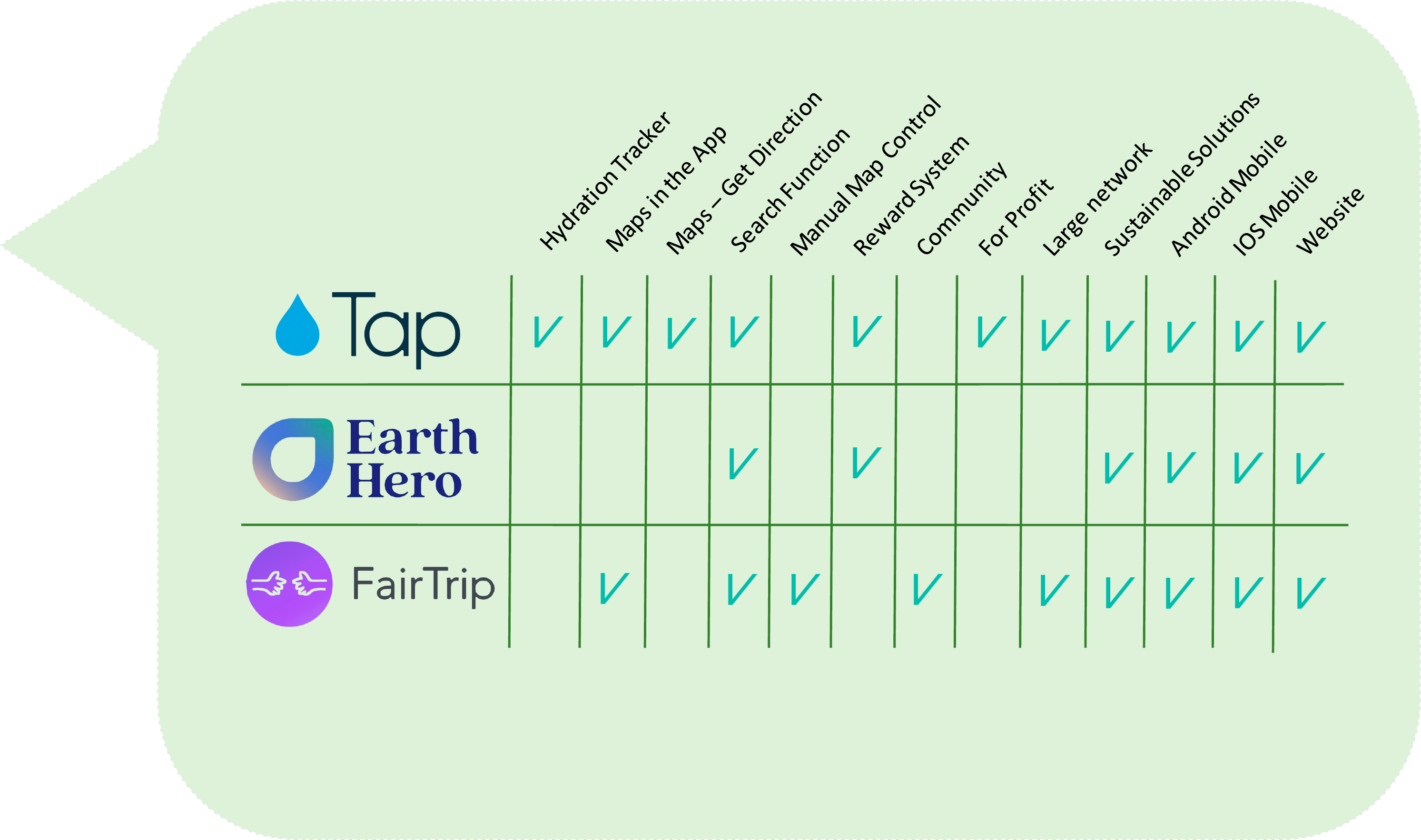
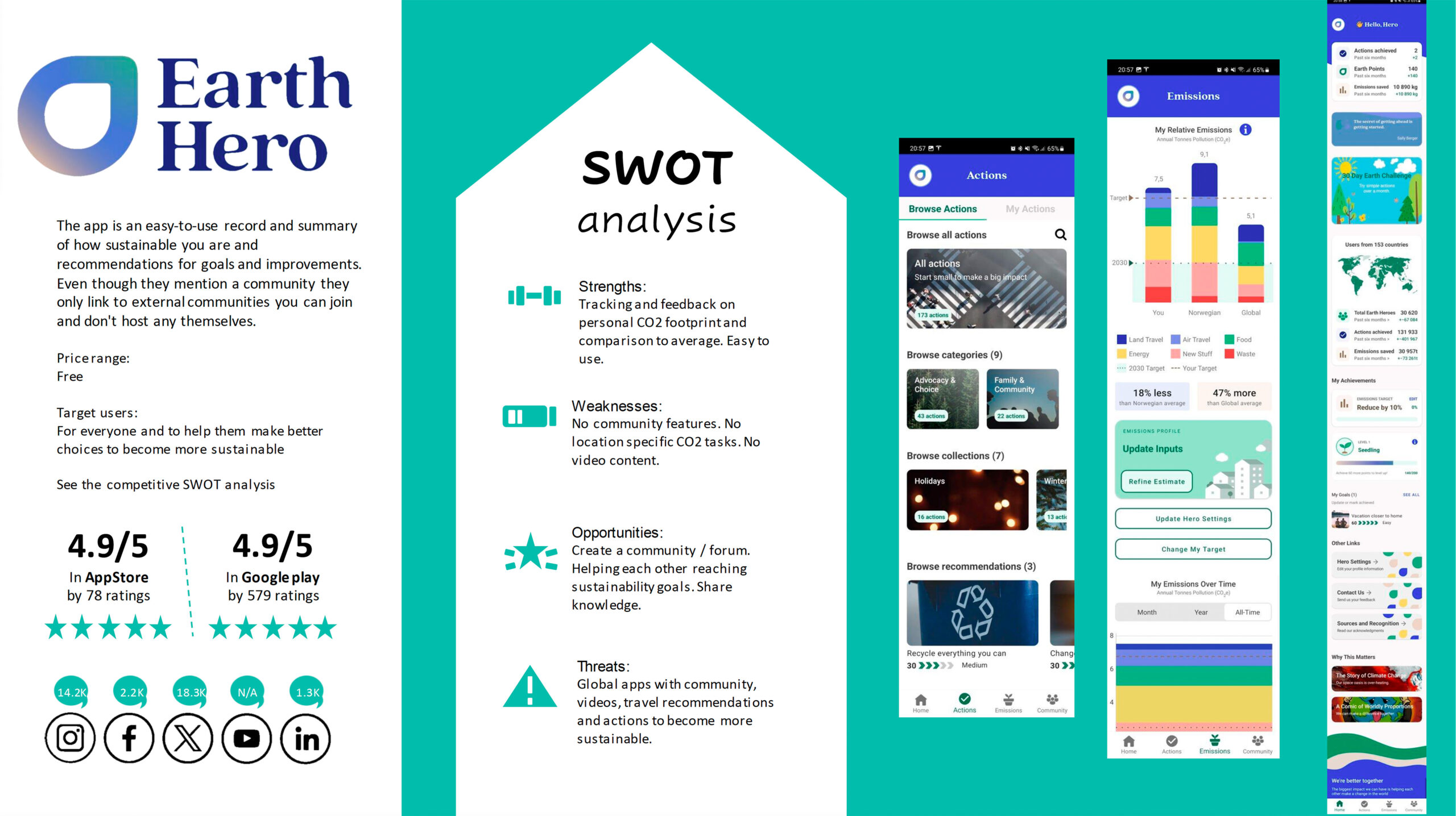
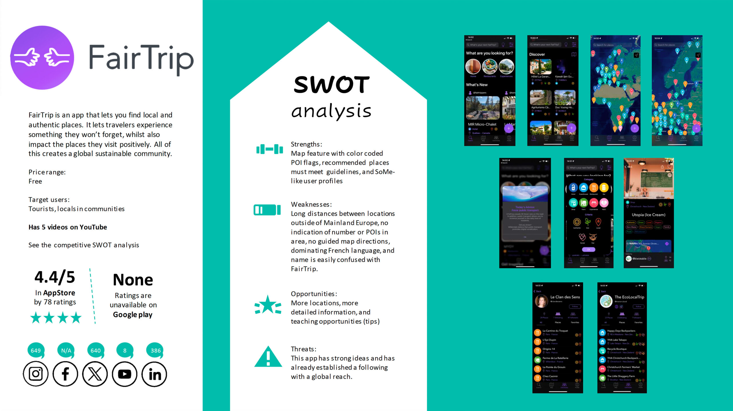
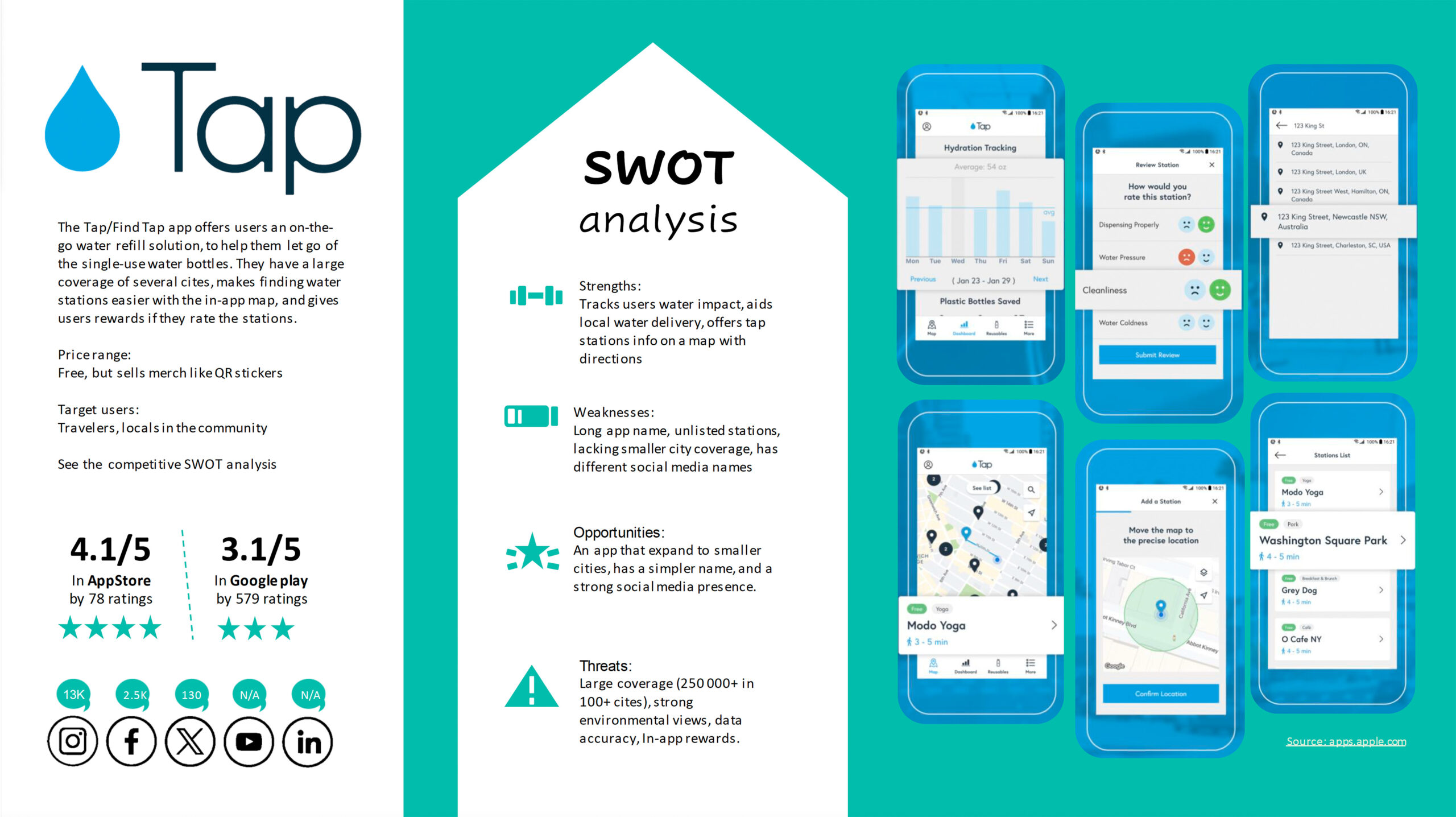
We began with generative and exploratory research to understand our users, their pain points, motivations, and what competitors offer. A literature review and competitive analysis provided initial insights, which we used to create the pre-interview survey screener and the interview questions.
The literature review and competitive analysis informed our pre-interview survey screener and questions. The screener helped us gather insights for deeper probing during interviews.
We also found that while many competitors aimed to assist users in becoming sustainable, there were significant coverage gaps in certain areas.
Data Analysis
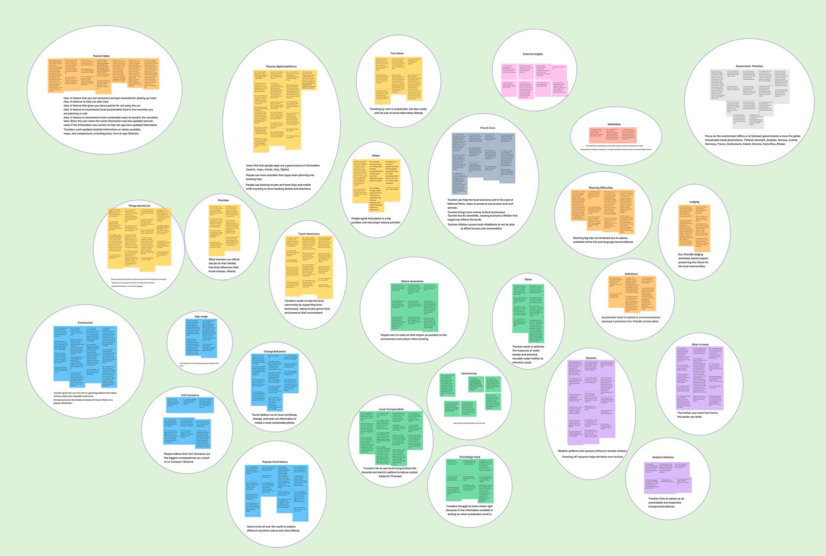
We gathered 270 key facts from our research and synthesized them through affinity mapping into 44 themes and nine insights. Key takeaways include:
-
Its difficult to conserve the environment, even if the tourism supports the local communities
-
Providing sustainable travel information could help educate and prevent littering.
-
The lack of accessible info online causes confusion. No one knows what’s right or wrong.
Problem Statment…
“Eco-conscious travelers struggle to find up-to-date and easily accessible information online on how to travel sustainably due to outdated resources and language barriers. Solving this issue will help travelers of all levels of expertise make informed, eco-friendly choices while making our future platform the go-to resource for sustainable travel. It will also improve the travelers’ overall user experience and engagement.”
Persona Defined
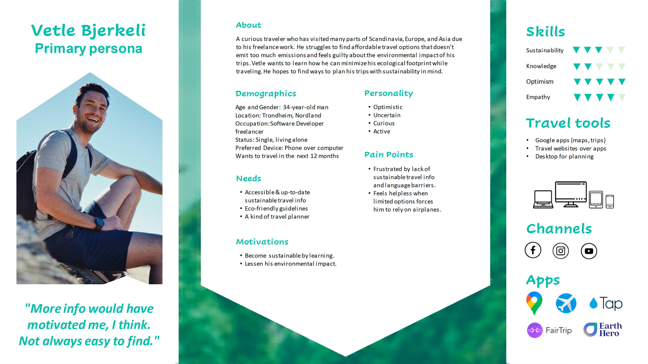
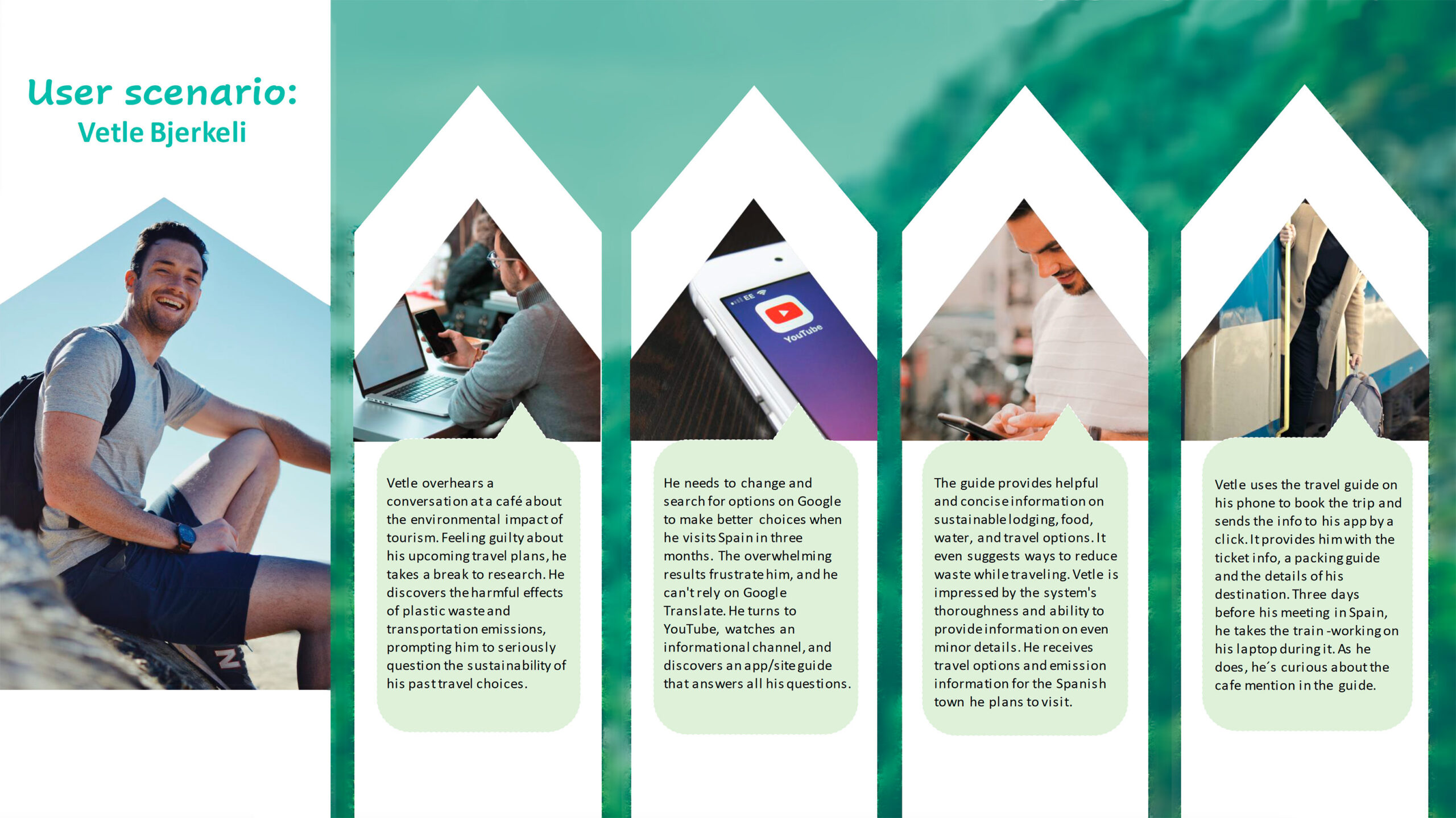
After the problem was clearly defined, a primary persona was created. We were to have a novice traveler represent the primary users since this is where most travelers start.
Not everyone is an expert at a task when they first start. And those with expertise would probably like to learn more, and introduce it to other novices.
Our reason for this is backed up by the Fogg Behavior model: easy tasks motivate a user. Our Primary Persona, Vetle Bjerkeli, wants to improve but needs a place to start.
Ideate & Plan
Ideation Workshop
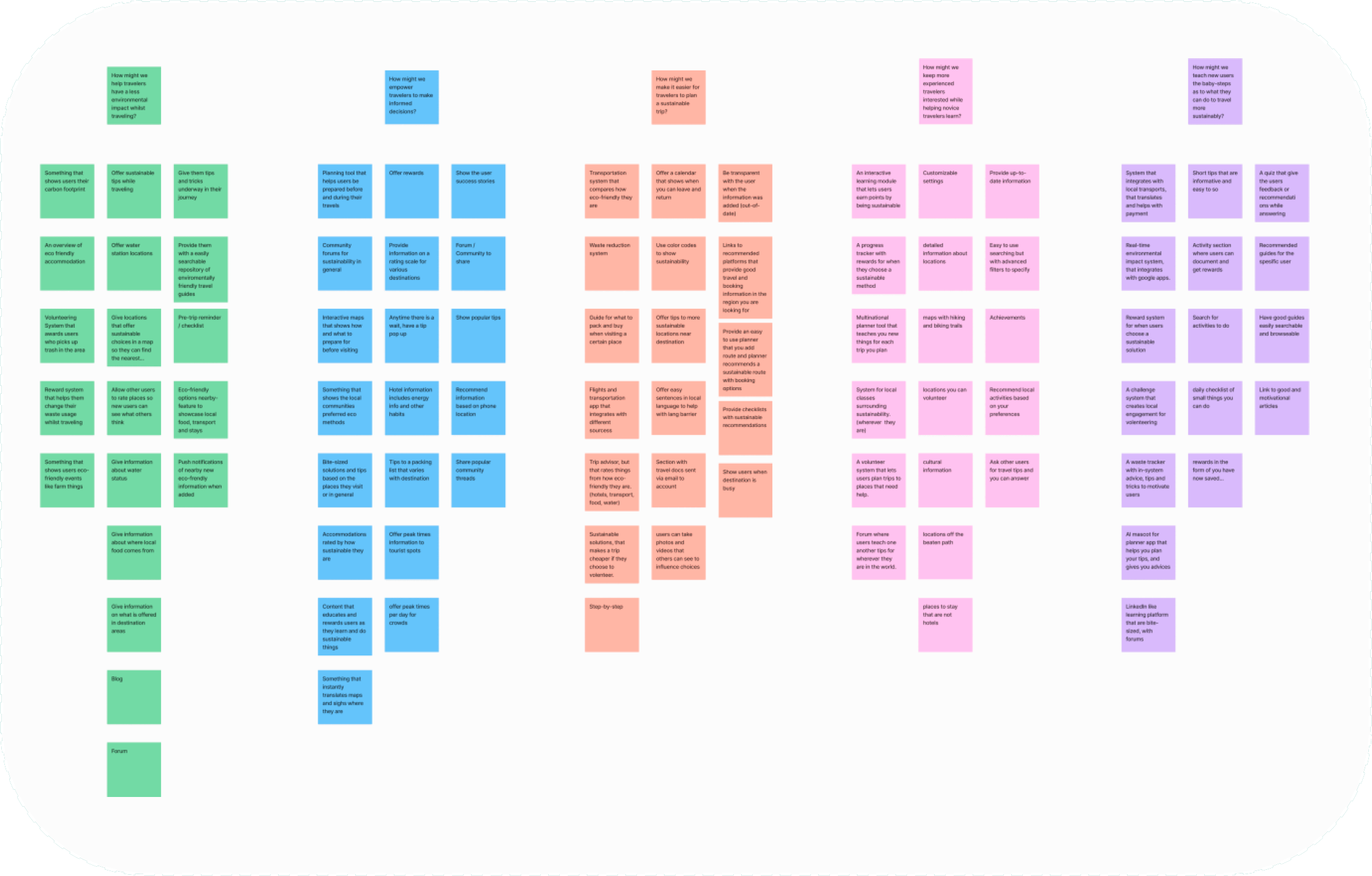
For our ideation, we decided to do it remotely within the team. We ideated around questions about how we could teach the users, empower them, help them have less Co2 impact, and make it easier for users to plan their trips.
We did so by using divergent techniques, such as brain walking (similar to brainstorming, but where one travels around “the room” to different places to brainstorm).
Ideation Workshop – Converge
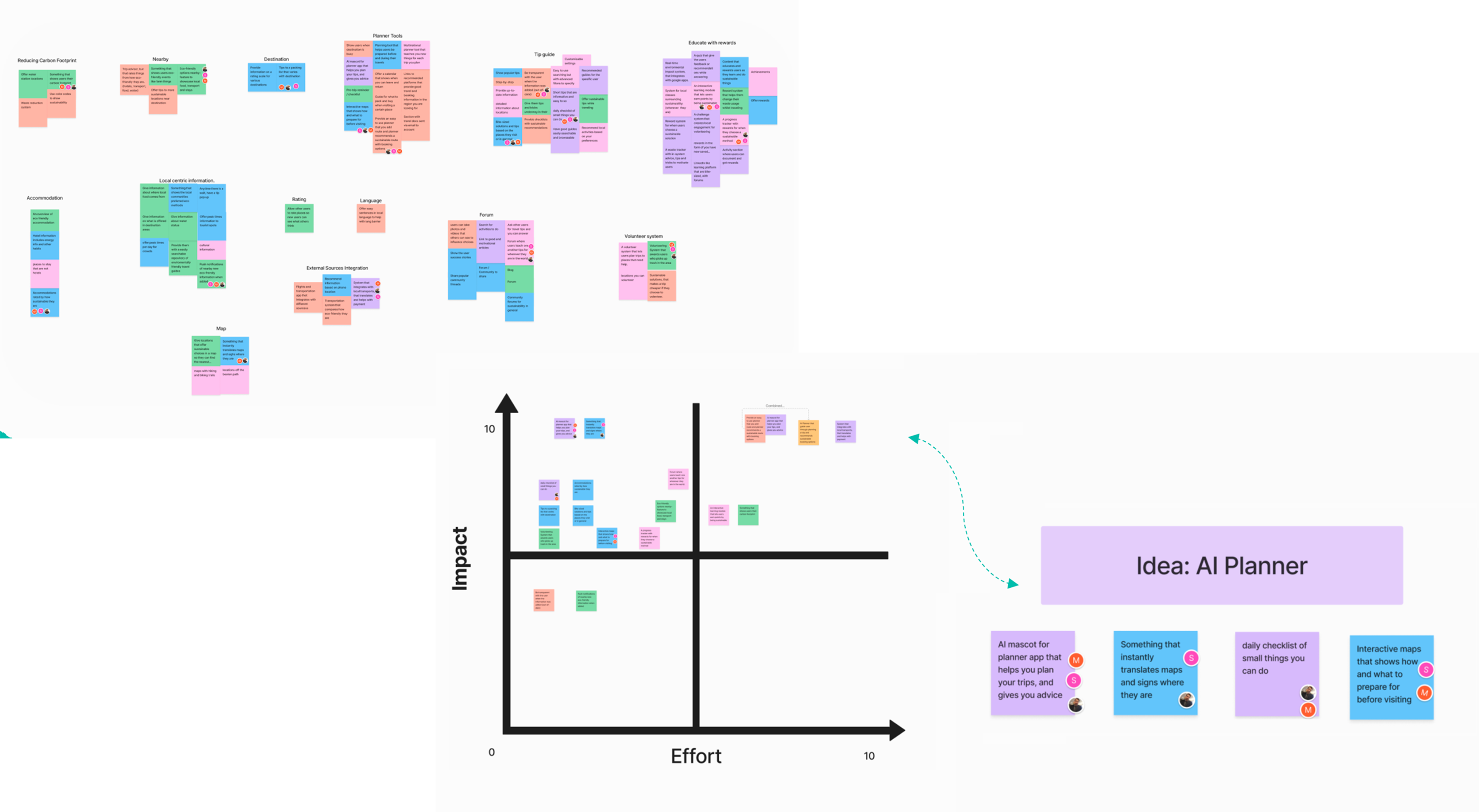
This was then converged using affinity mapping to group similar ideas, dot voting on the best ones, and limit these with the Impact vs. effort method. From here, we combined some of our best ideas into one:
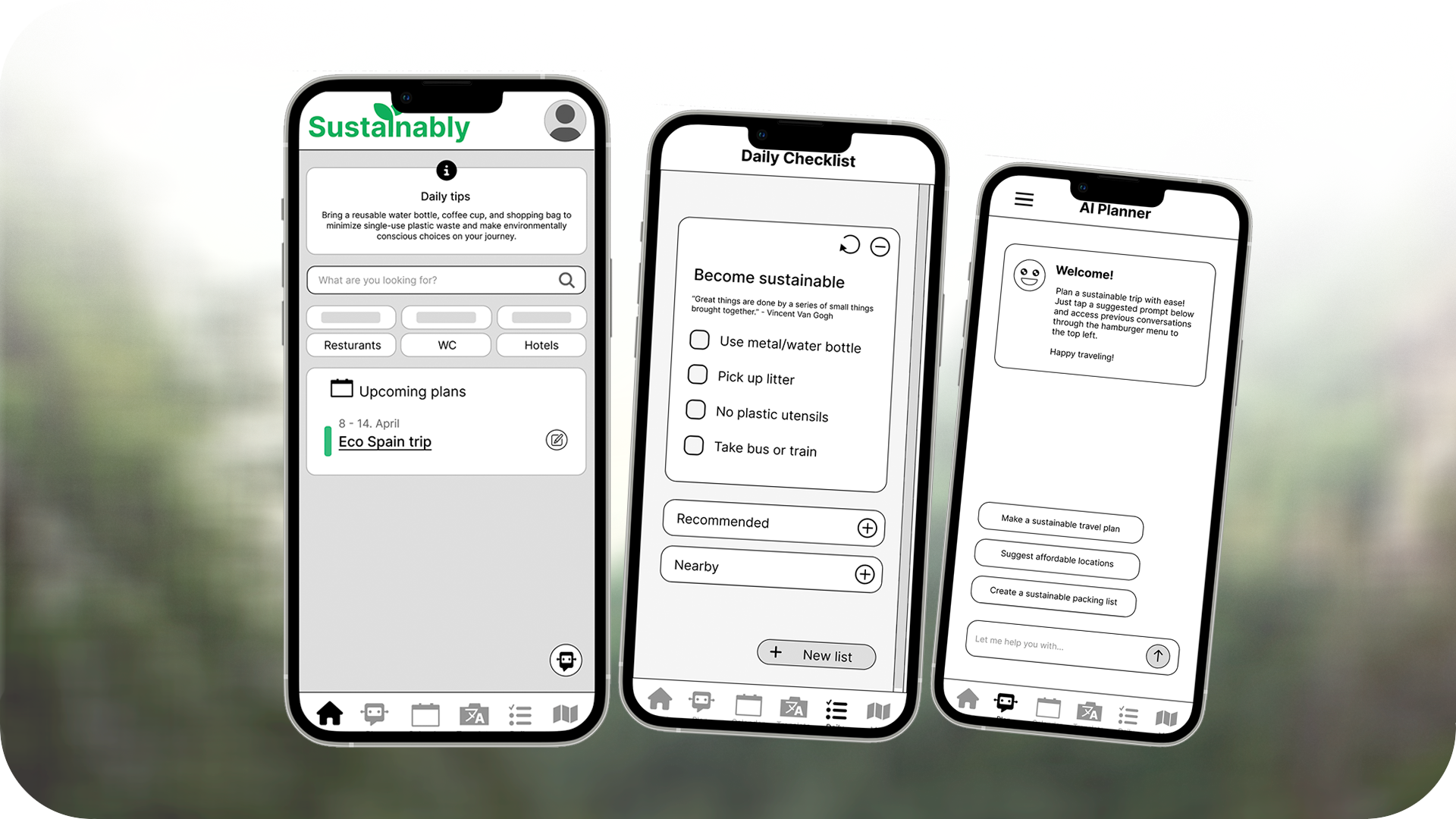
An AI planner with a map, translation system, and checklist to help users become more used to sustainable habits.
Planning
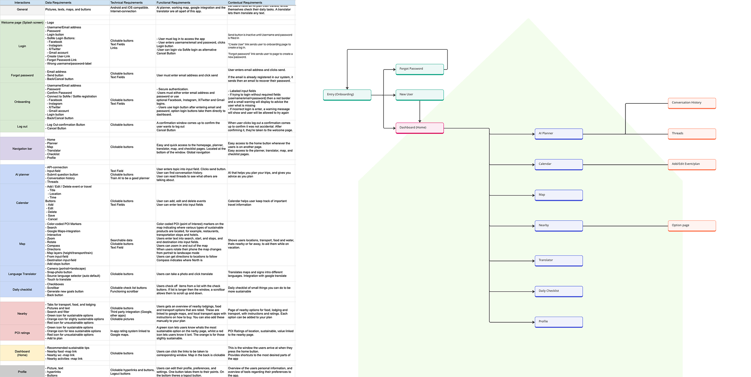
We collaborated to create a solution requirement document and Information Architecture. We chose a hierarchical structure along with a simplified overview, initially developed by one team member and reviewed by all.
This guided us in creating user and task flows. For the requirement document, we organized pages and features, prioritizing through a MoSCoW session.
Vision statement…
“Sustainably aims to empower eco-conscious travelers by providing an AI planner that assists with planning, translation, navigation, and tracking sustainability goals. It will simplify travel decisions, making sustainable travel more accessible worldwide for both expert and novice travelers.”
User- & Task Flows
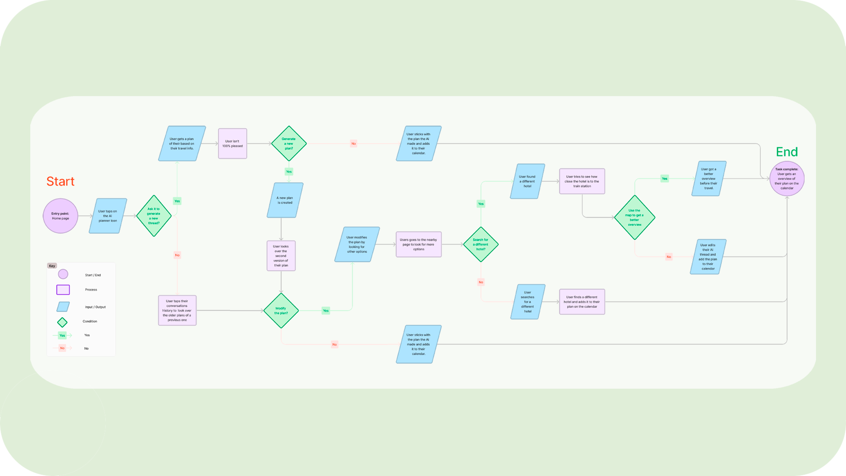
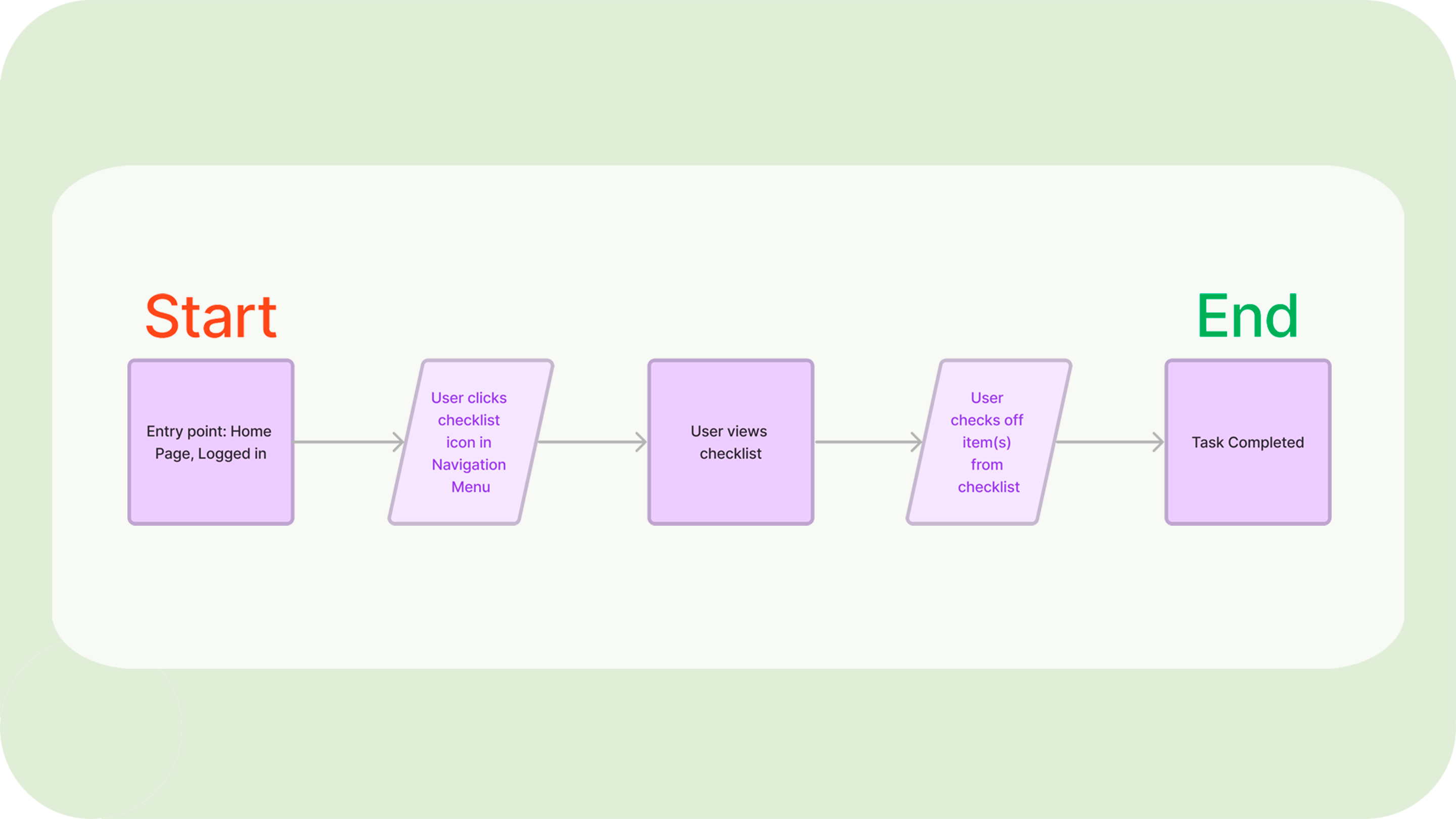
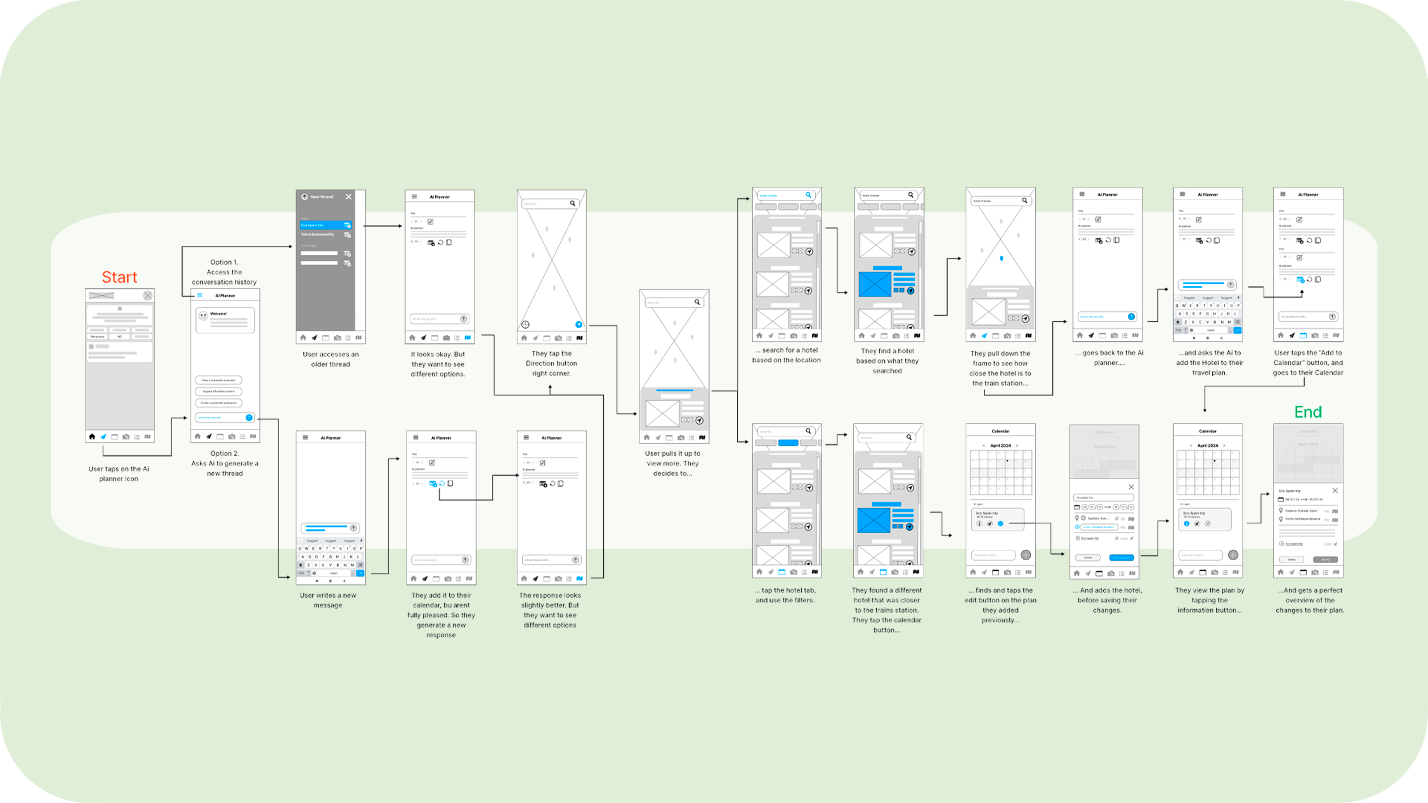
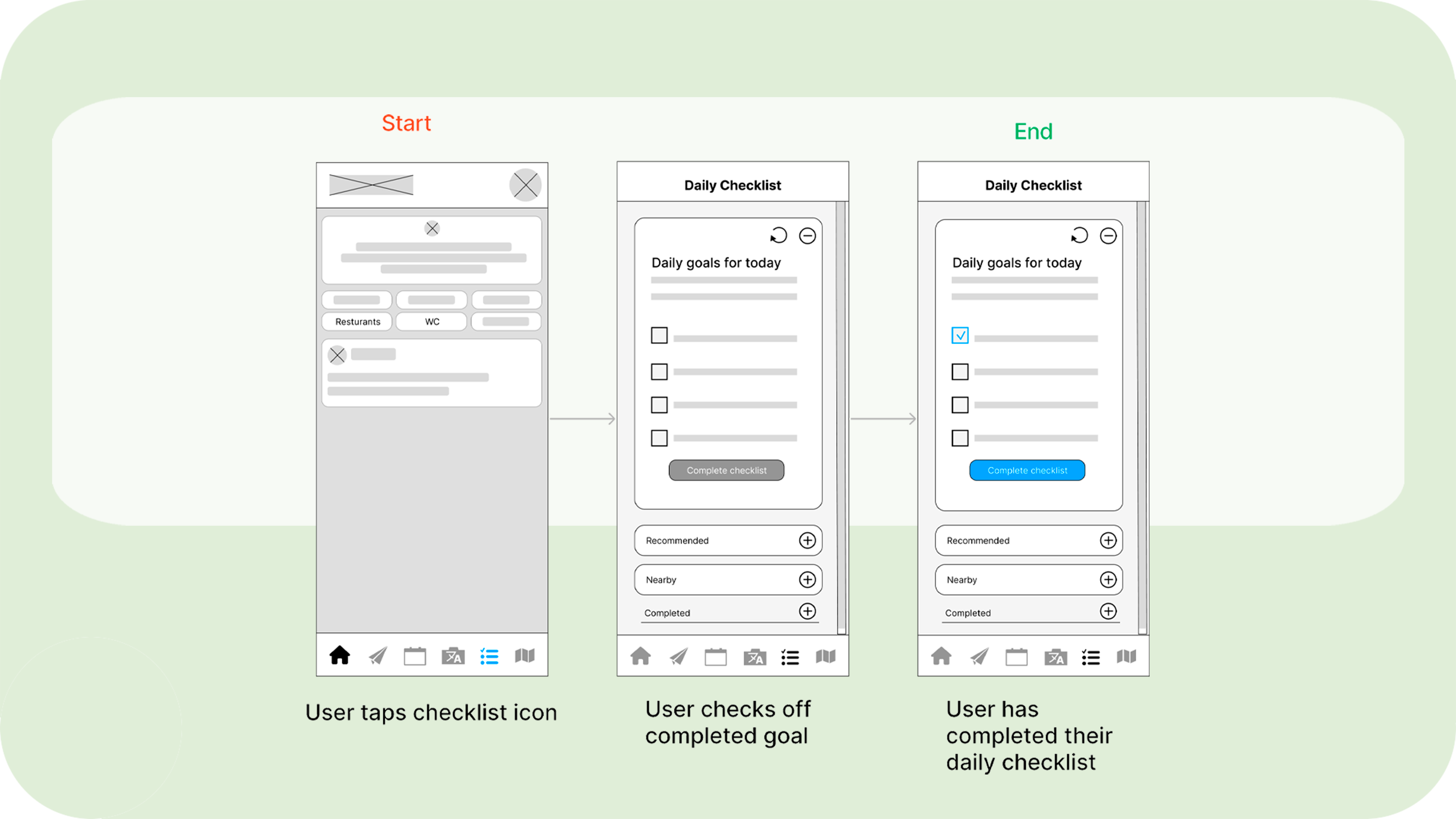
About 5 task flows and 4 user flows were created. But for this UX Case, I will be presenting one main User- and task-flow for using the Ai to plan the trip, and to check off their daily sustainable goals in their checklist, due to having worked on these two the most.
Ai Planner & Daily Checklist
For this UX Case story, I will choose to focus on the Ai planner and daily checklist due to how both was the core part of the prototype. These are also the aspects I worked most on during the project.
Prototype & Testing
Prototyping
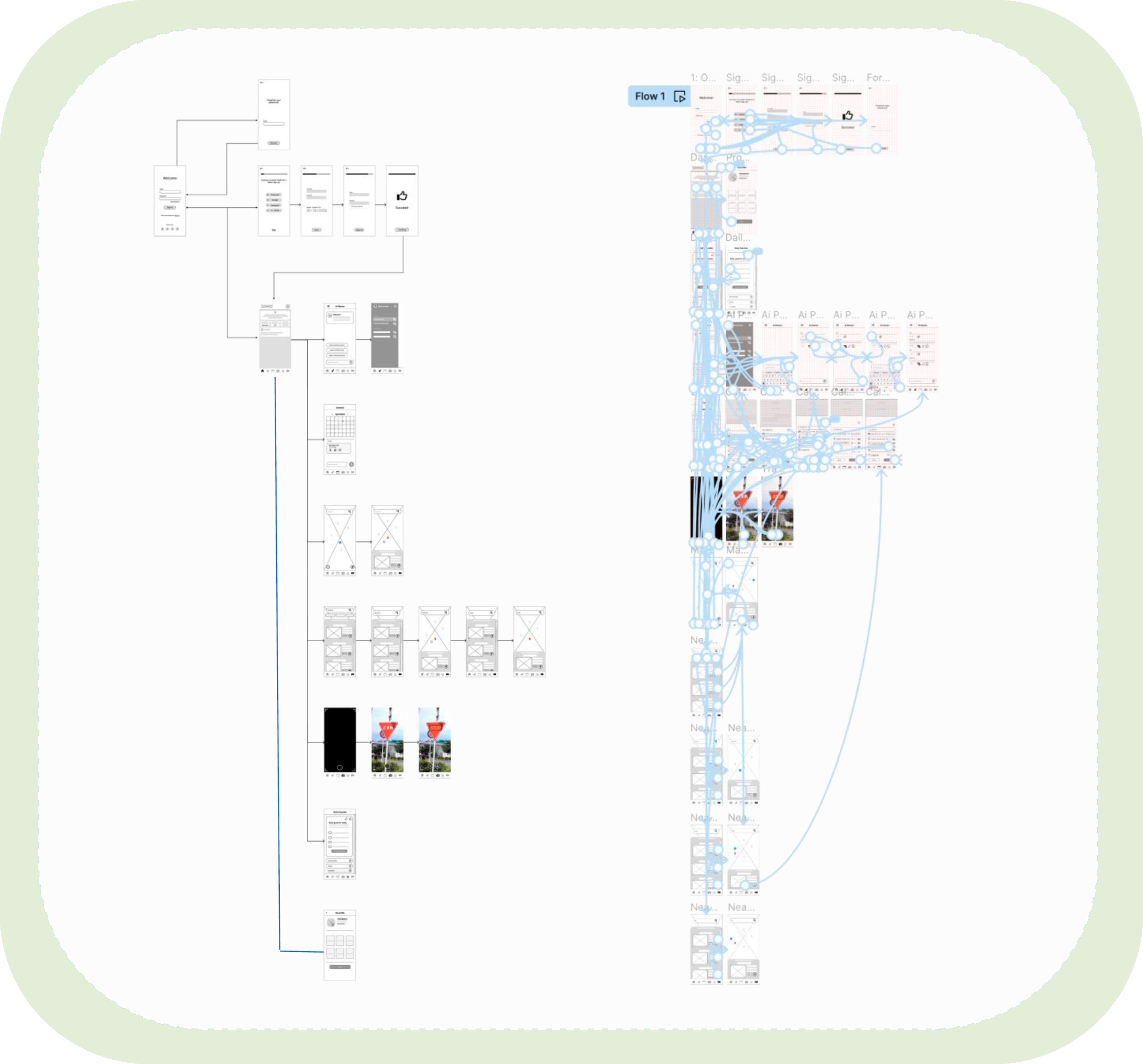
We started by creating low-fidelity wireframes for the prototype, which helped users feel more comfortable sharing their thoughts without worrying about flaws. Focusing on the overall UX and navigation was key.
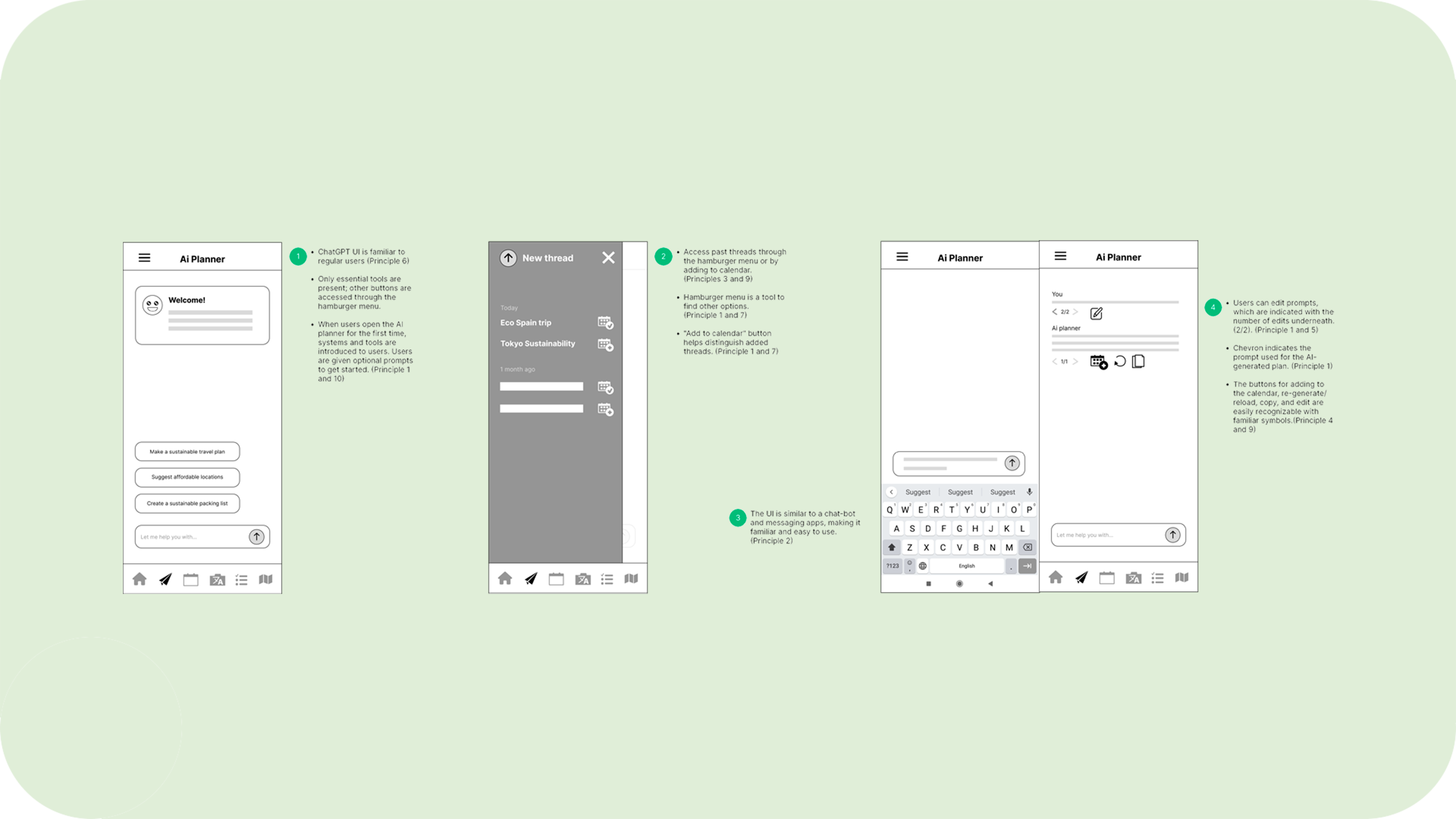
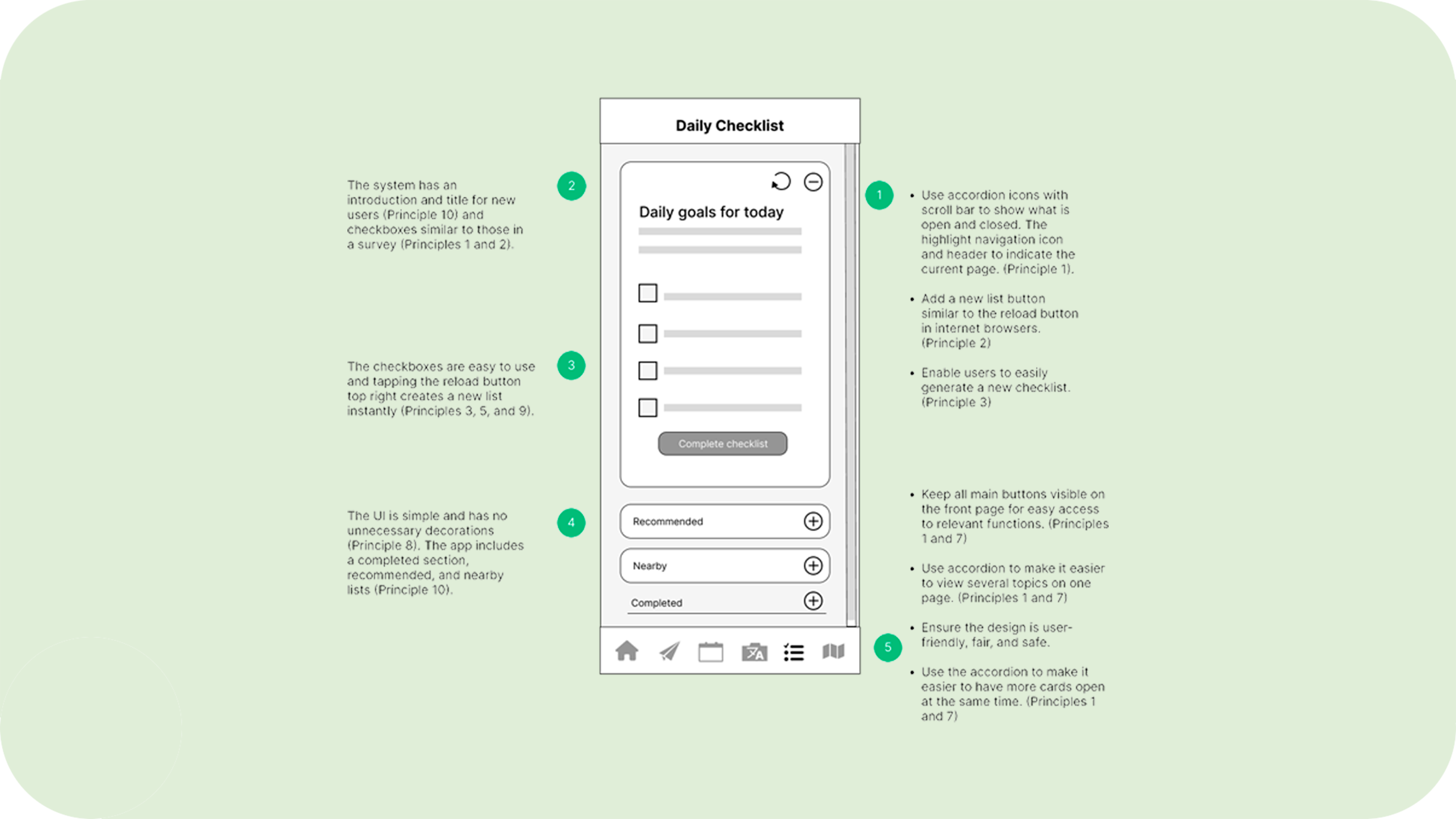
Then, we developed workflows based on the previous flows, using familiar design patterns. The AI planner resembles chatGPT, while the checklist looks like something you’d find in a survey or on a regular checklist on either a notes app or a physical checklist.
As we refined the designs, the team aimed to balance inspiration and originality, crafting something familiar yet refreshing for users. Users should be able to recognize and understand what they are looking at, and understand it at first glance.
Usability Testing
A moderated remote usability testing session was conducted, with participant matching the primary personas common demographics. This was done by inviting the participants from the research phase, since they had already been pre-screened and willing to test our low-fidelity prototype.
We wanted to evaluate how easy the navigation, Ai planner and other features in the app was. This was done through Zoom, and through screen sharing.
Recruitment
About 6 participants were recruited to test the low-fidelity prototype. We did so by inviting back the people we interviewed, which saved us time since these people had been pre-screened. We had them do a screener survey before the test. This helped us evaluate them further and gather qualitative facts and findings.

KPI Metrics
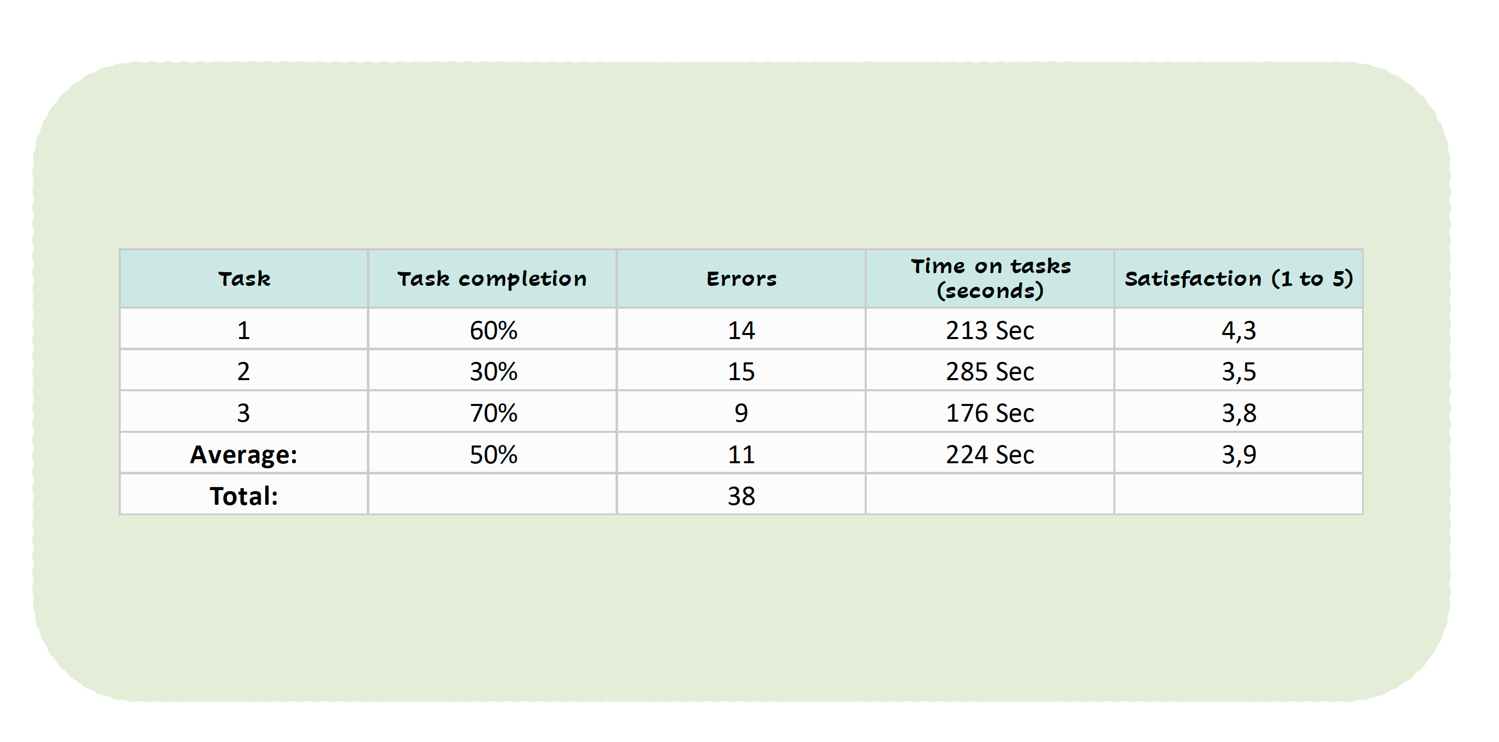
To establish benchmarks, we needed to know what the average completion rate, time, and error rates were. We also needed to know the overall satisfaction rate for each of the tasks. What we discovered was:
-
50% users in average completed their tasks.
-
In aerage, there were 7 bugs and 3 user flow bugs
-
224 second is the average time spent on all tasks.
-
3,9 out of 5 is the satisfaction rate for all tasks.
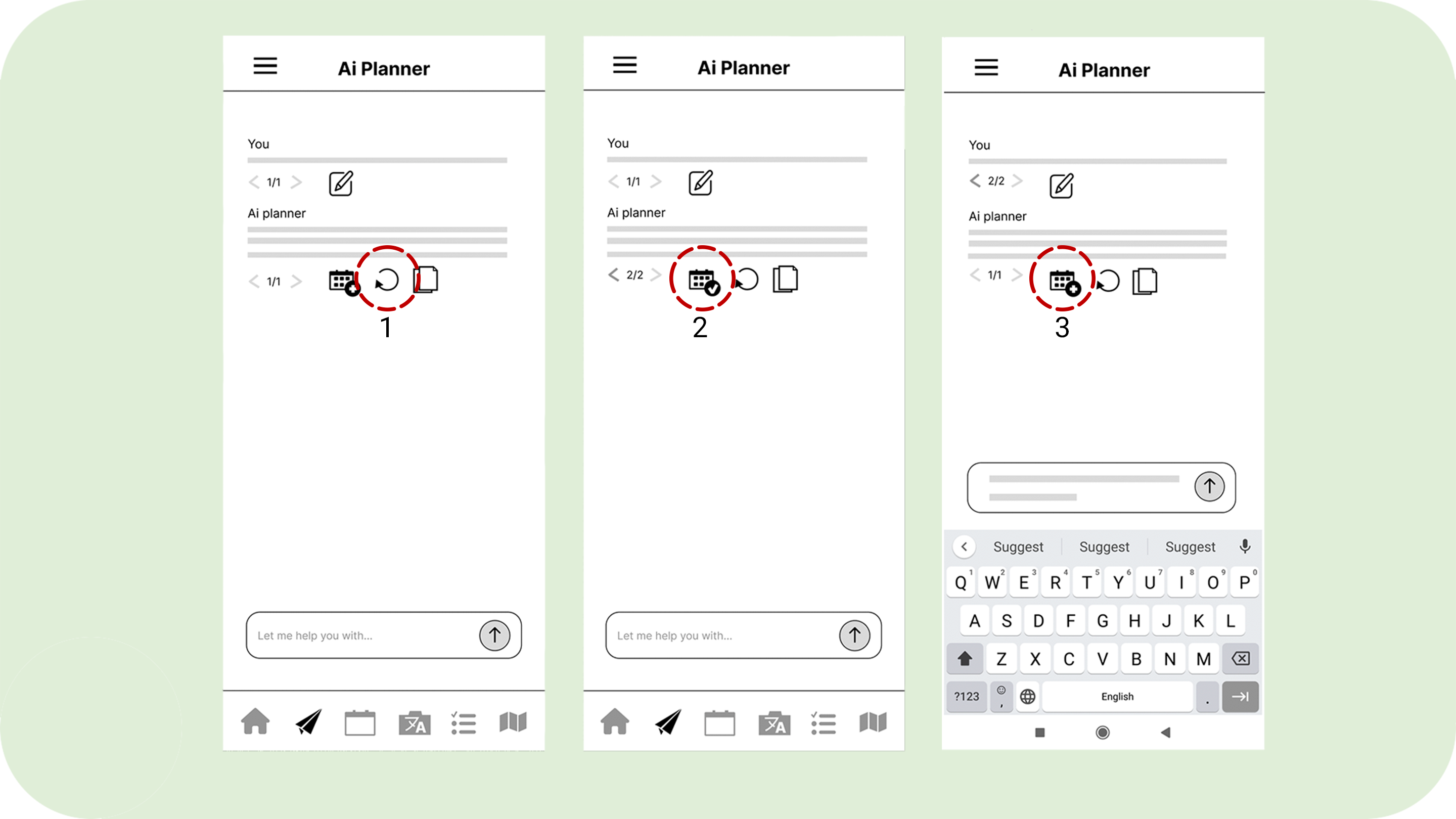
Errors and Bugs – Ai Planner
The edit and re-generate buttons led to unordered pages (1). One if the «add to calendar» is marked as added (2), and didn’t work when the input field was active (3).
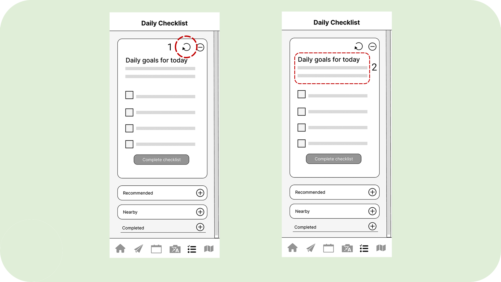
Errors and Bugs – Daily Checklist
The refresh button didn’t work when users tried it (1), and the lack of context made users think it was a packing list (2).
Data Synthesizing
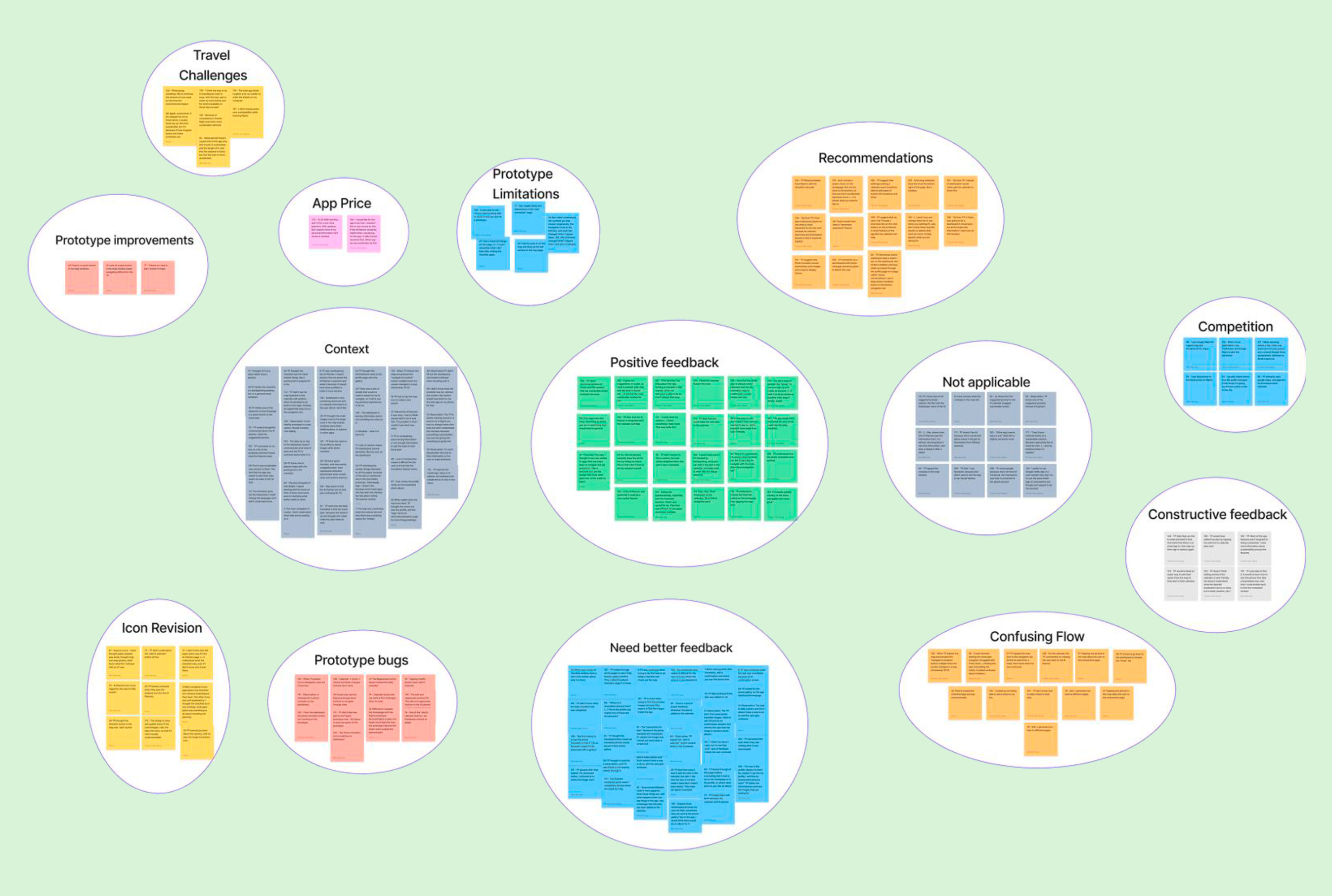
We all tested 2-3 participants each, and did some post observation later to analyze the 180+ facts and findings through affinity mapping. 14 themes & 10 insights were discovered. Summarised into three, they informed us that:
The low-fidelity wireframes, unclear icons, and navigation is difficult to understand.
A better visual feedback, improved AI planner layout, and a intuitive dashboard would better the UX.
Affordable prices are preffered. Users expect the features to support the sustainable travel.
Next Step: Upgrade to a mid/high-fidelity prototype, refine icons and navigation, and implement key user-requested features.
Design Iterations
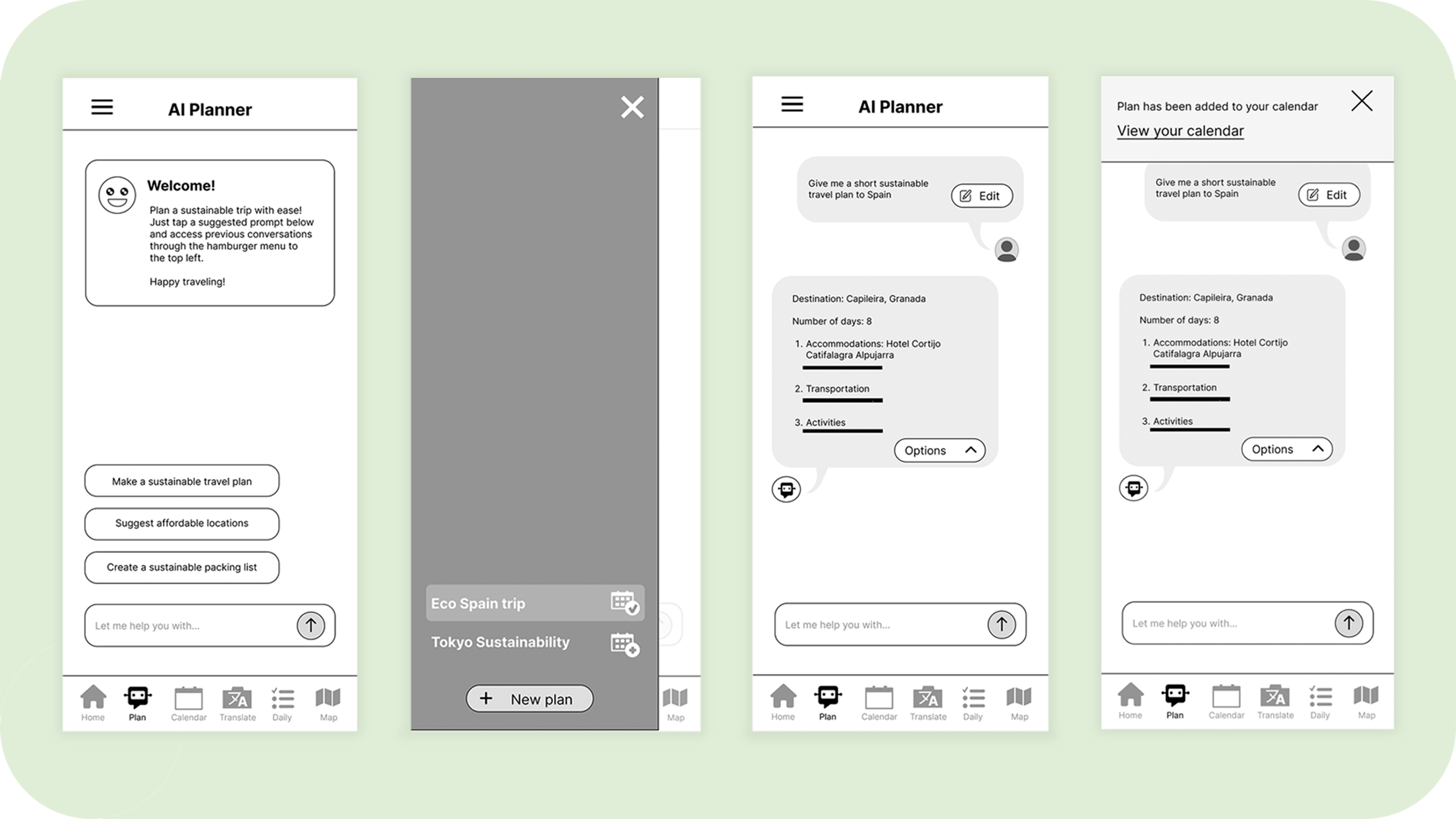
Ai planner
We added a context card and suggested prompts for easier task initiation, moved the “new plan” button in the hamburger menu to the bottom and turned the AI conversations into speech bubbles with a drop-down menu to reduce clutter. The user will also be alerted if the plan has been added to the calendar successfully.
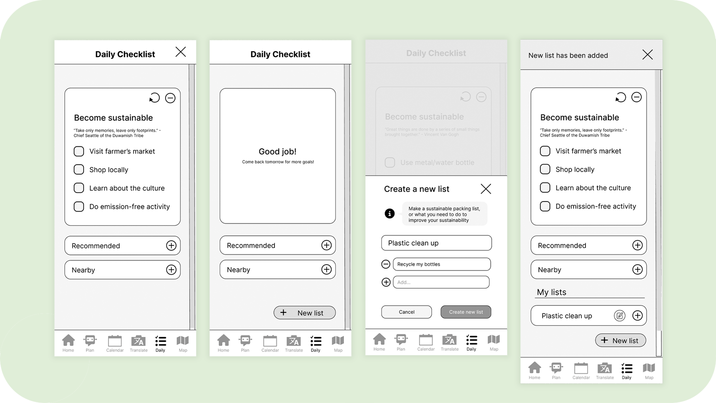
Daily Checklist
The name «daily goals» was changed to «become sustainable.» This helped improve the context, since users though it was a general checklist. A success message was also added, along with a «new list» button close to the thumb zone which users can tap to create their own personal sustainable goals.
Final Project Coclusions
The iterative design process helped us create a user-centric prototype for sustainable travel, but we faced some challenges. Collaboration took time, particularly during planning and design, as we needed to ensure consistency in elements and navigation to identify flaws.
Teamwork proved essential for enhancing the product, even in its early stages. While low-fidelity prototypes are useful for testing, they can lead to confusion among users. As a result, we decided to increase the fidelity from low to a mid during the design iterations phase.
Next Steps
Do a UX rewamp by creating a High-fidelity of it.
background image: pexels.com
